The
Process
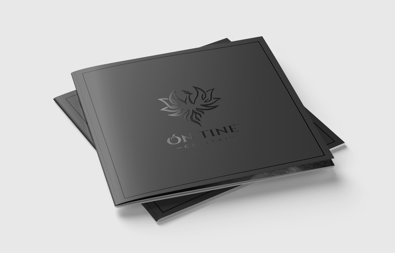
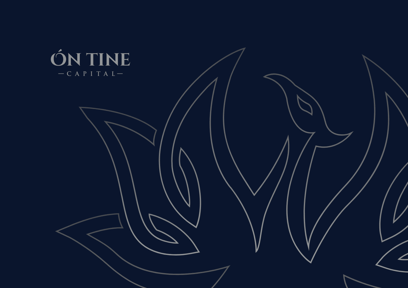
The first step for this brand was to create a logo. Ón Tine had a clear direction in mind - they wanted to pay homage to the name of their brand, which means "from the flames" in Gaelic, by using a phoenix as their icon. Our designs pushed the Gaelic connection even further, introducing a Celtic knot element to the shape. The logo was a success, and Ón Tine were keen to see it used on the website, so the homepage designs included an intricate ident of the logo being drawn.
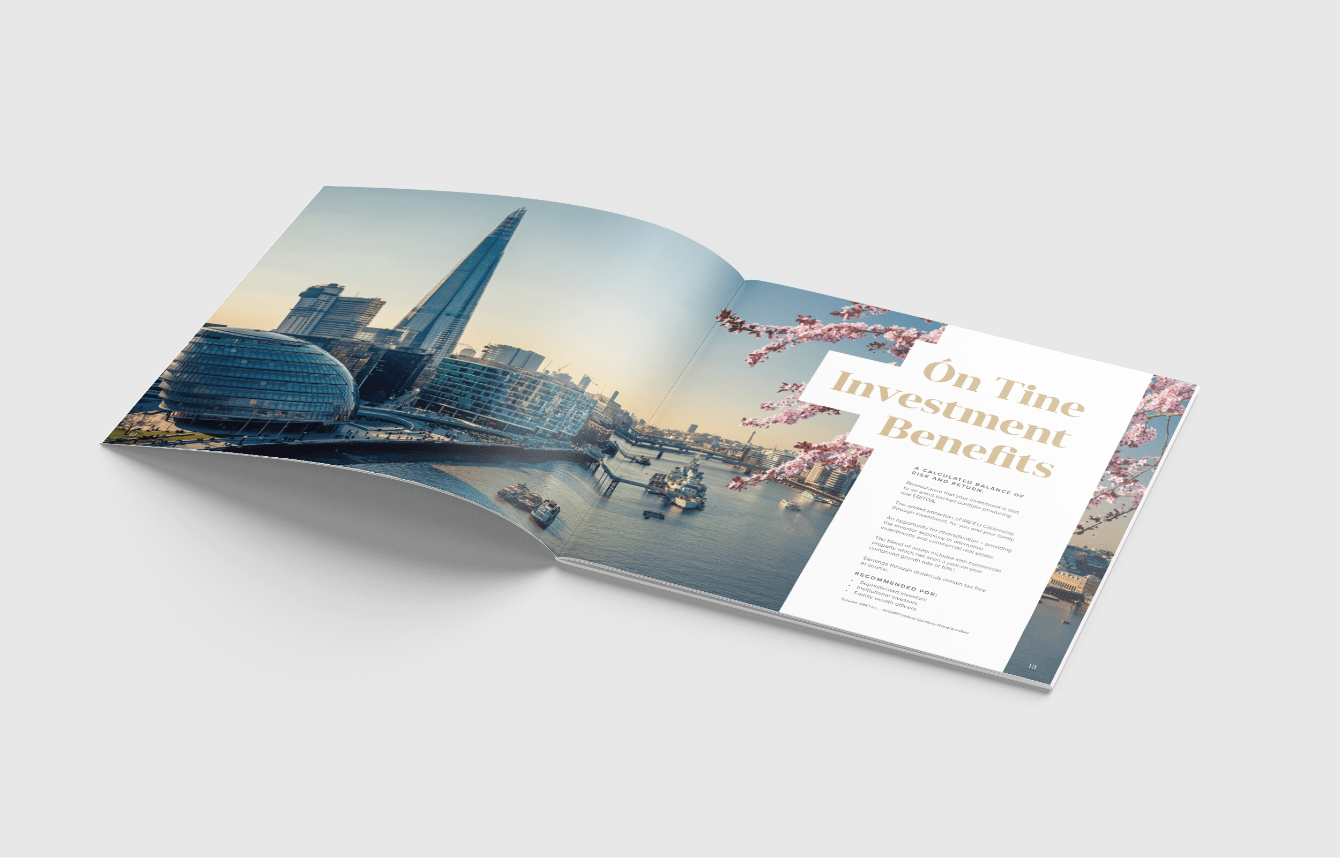
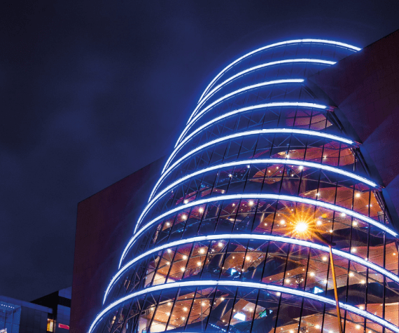
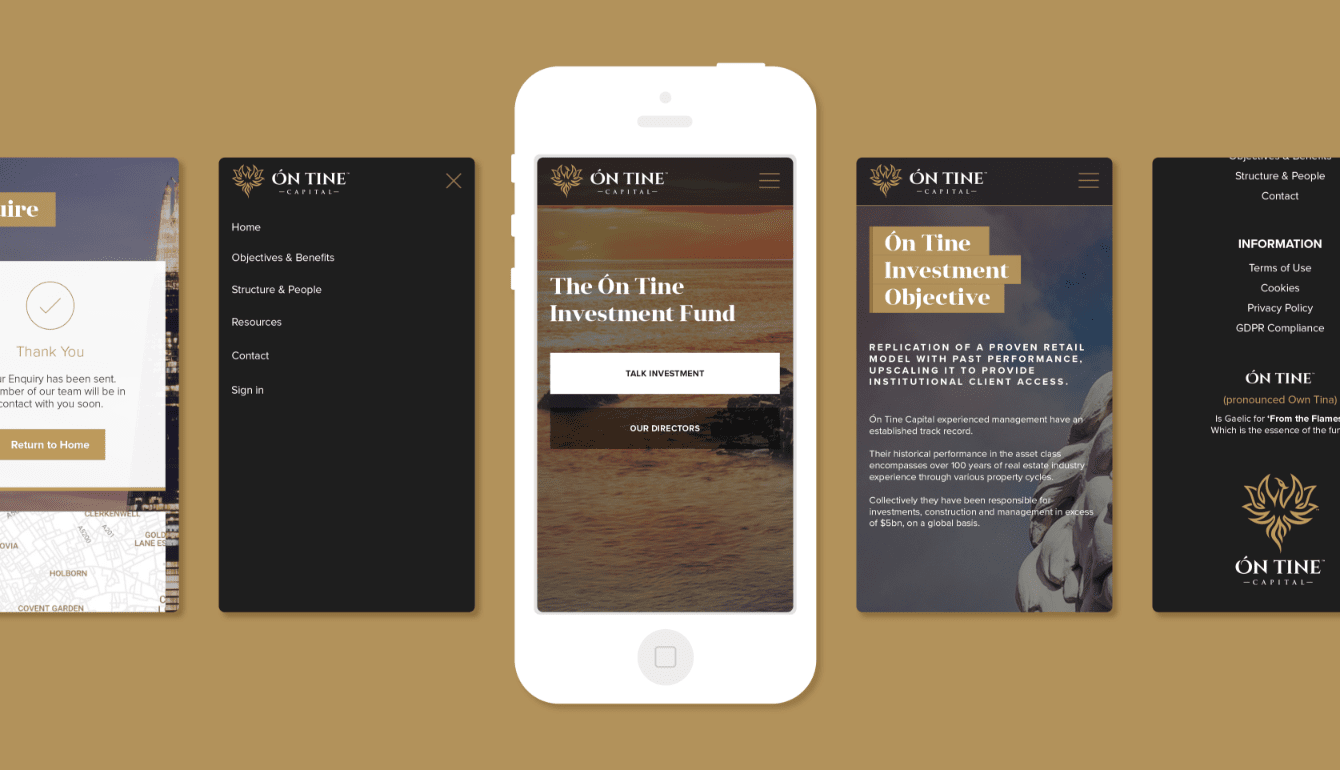
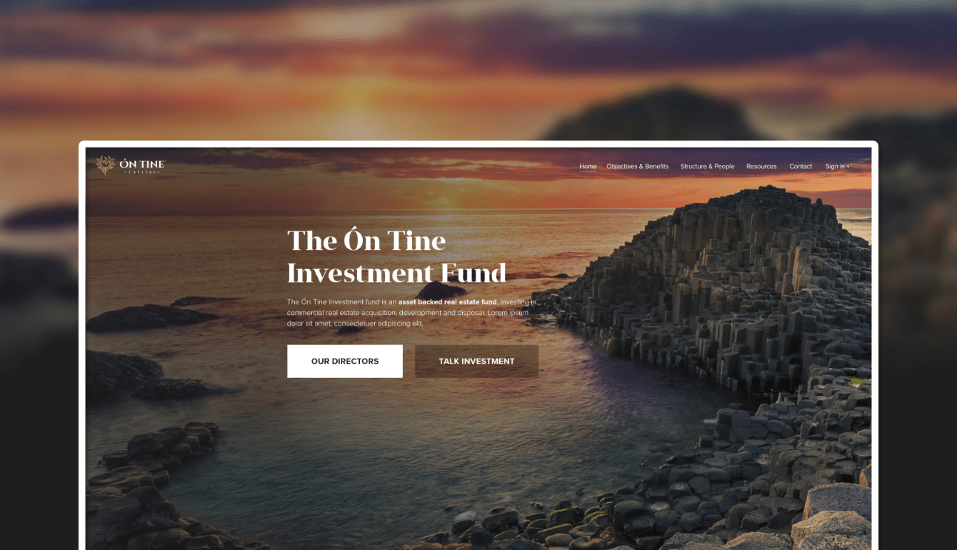
We listened to Ón Tine's desire to have the beauty of Ireland, where a significant portion of the business's interests are located, at the heart of their brand. We worked with them to source striking landscapes and city scenes which would form the core of the homepage design. The significance of these images to the brand saw them carried over to the brochure design.
Logo
Design


Logo
Ident
Homepage
Design
Brochure
Design
