The
Process

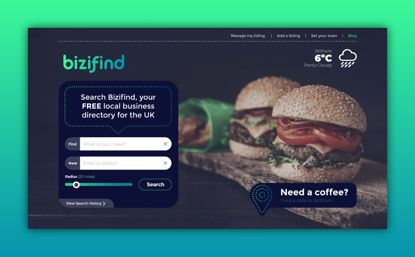
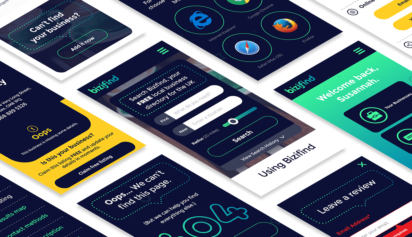
Working closely with BiziFind, we established the personality of the brand as being a mix of technology and connectivity, whilst also remaining fun, friendly and approachable for the end user. We began with a variety of logo concepts, and with our clients narrowed these down and tweaked them until we landed on a clear, eye-catching and simple font with gradient colouring. The blue and green tones lead us into a space, and rocket theme, which captured the facets of BiziFind's personality perfectly.
Logo
Design

Homepage
Design


